
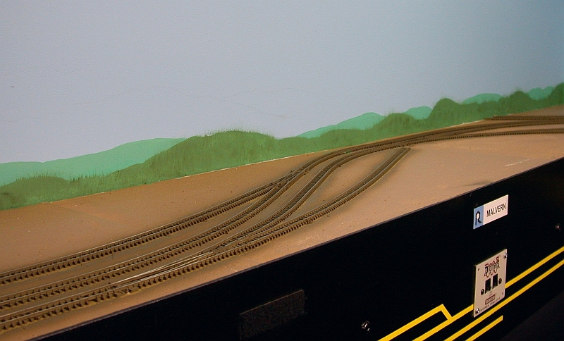
OK this time I tried a couple of different things. I started with a
much lighter green but still had to add a bit white for the distant
hills. Then I added some yellow to bring back the green and finally
added a touch of blue to fade it a bit. For the closer hills I just added some
darker green to the color I used for the distant hills.
I also wanted to give the closer hills a bit of depth, so I stippled the darkest
green I had into the fresh paint of the closer hills. Using a medium
stiff fan brush, I pulled the darker green upwards, blending it into the fresh
paint. In a few places I accidentally pulled the paint onto the lighter
distant hills! This actually turned out to be OK, as it got rid of the
crisp line and made it look like a jagged tree line.
With the Fiancée standing behind me, uttering a few words of encouragement,
I felt that I was getting somewhere so I continued on.
I think by keeping the hills lower and using lighter colors panned out this time. Please forgive my photography, I need to get some better lighting equipment.
I went from this

To this


Someone commented that once a few buildings and some foreground scenery was in place, the hills wouldn't be so dominating. I placed a few structures on the layout to give the eyes something else to look at and almost immediately the hills seemed to fade into the distance.
This is the paint and brushes that I'm using.

I'm still no Bob Ross, but I'm feeling happier...
I had the same experience with the Marias Pass backdrop, and it took a couple of tries before I felt satisfied. I really like the final attempt. It really blends nicely.
ReplyDeleteThanks John!
ReplyDeleteIt's not bad, I'm happy, but I think I can do a little better with more practice. ;)